Improving an offline experience service for children on an education platform
After we provided the ‘Children Experience’ service in the education app, we expanded the content as the number of customers increased. In addition, we decided to expand on the business goal, taking it from an educational experience activity to an online store. We aimed to improve the service experience before starting the next new business.
Setting up strategy, IA, Analysis competitor, Wireframing, Visual Design, Design of Android
1month, May 2019
What is 'Play'?
This content helps students experience various activities connected to subjects such as history, English, science and art. The product provides the opportunity to experience not only school subjects but a future career.
The project has three objectives
1. Expand the commerce experience on the main page.
2. Reorganise the category menu, access and page navigation processes.
3. Check the shopping experience on one page, from shopping through payment.
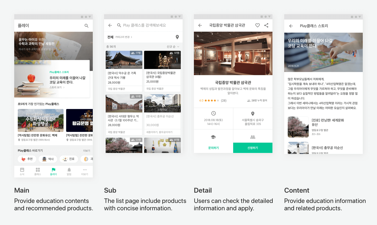
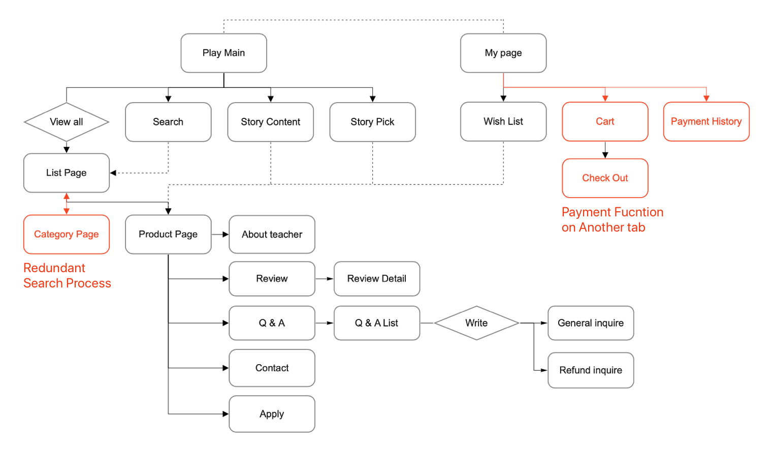
Viewing the entire structure at a glance
The problem is, there are a large number of pages, and some were designed inconveniently. I drew the IA of the tab to figure out the current structure. I included the entire product structure in this, which allowed me to identify where the problems existed.
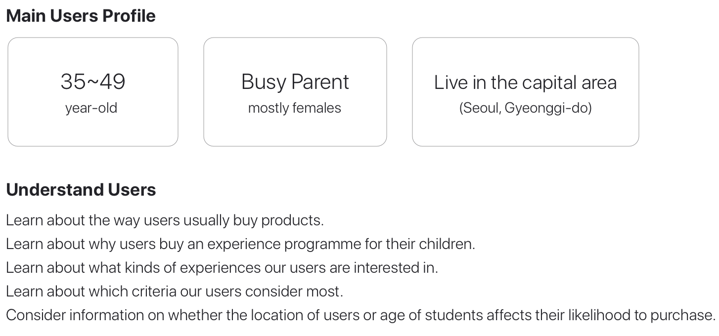
Knowing about users
In order to understand the user, we examined the users’ behaviours, needs and frustrations. For this, we checked customer feedback and data, as well as sales data, and we discovered which products customers prefer.
Identifying problems in the user experience flow
I organised a concise user journey map according to the user experience flow. These processes let us identify where customer pain points are and which parts have more impact on the business goal. After aligning with the PM and product MD, we decided which pages needed to be modified, according to priority. The first step, in which users approach the page, and the payment step leading to sales were the most important.
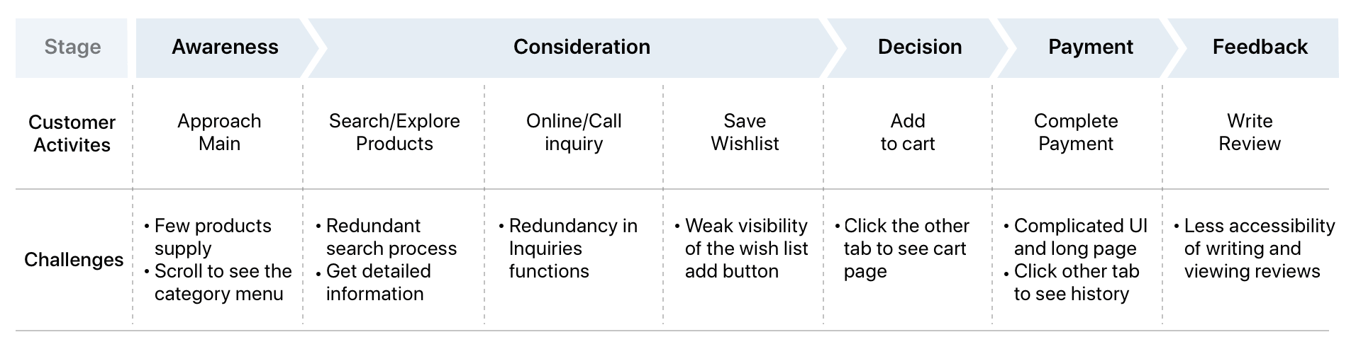
We proceeded with the following three points as a priority
Provide all activities related to the shopping experience, including searching and completing payment, on the same tab, so users keep their focus on shopping without leaving the tab.
Improve the accessibility of each category by placing category menus at the top.
Provide commerce features, such as personalised recommendations and sale items, on the main page, and consider the characteristics of users who are interested in other parents’ reviews and low prices. Group various products to make the content look rich.
Initial wireframes
I created low-fidelity wireframes to solve the problems and discussed it with the PM and MD in charge of the product. I considered the category menu and how users conveniently use it. To provide a commerce experience that increases the purchase rate, I constructed wireframes based on user data and product sales data.
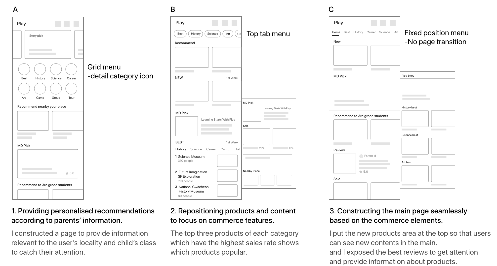
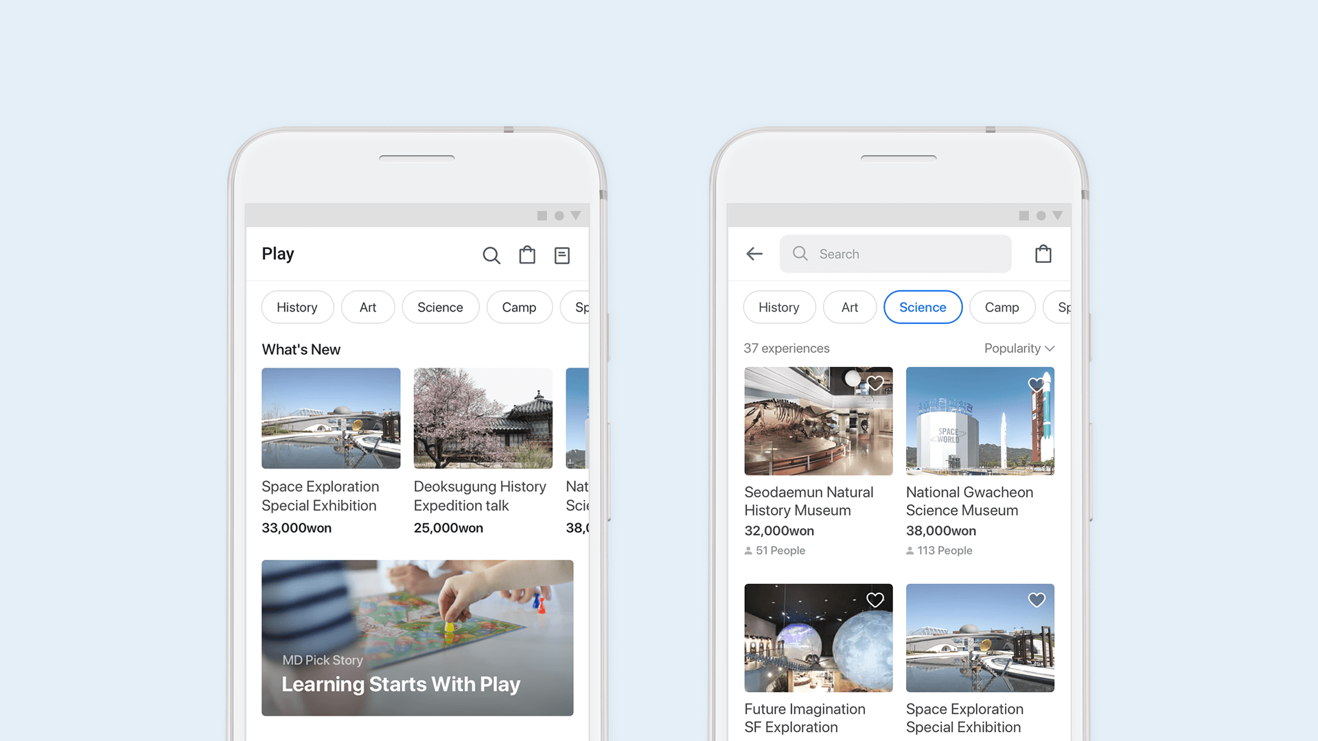
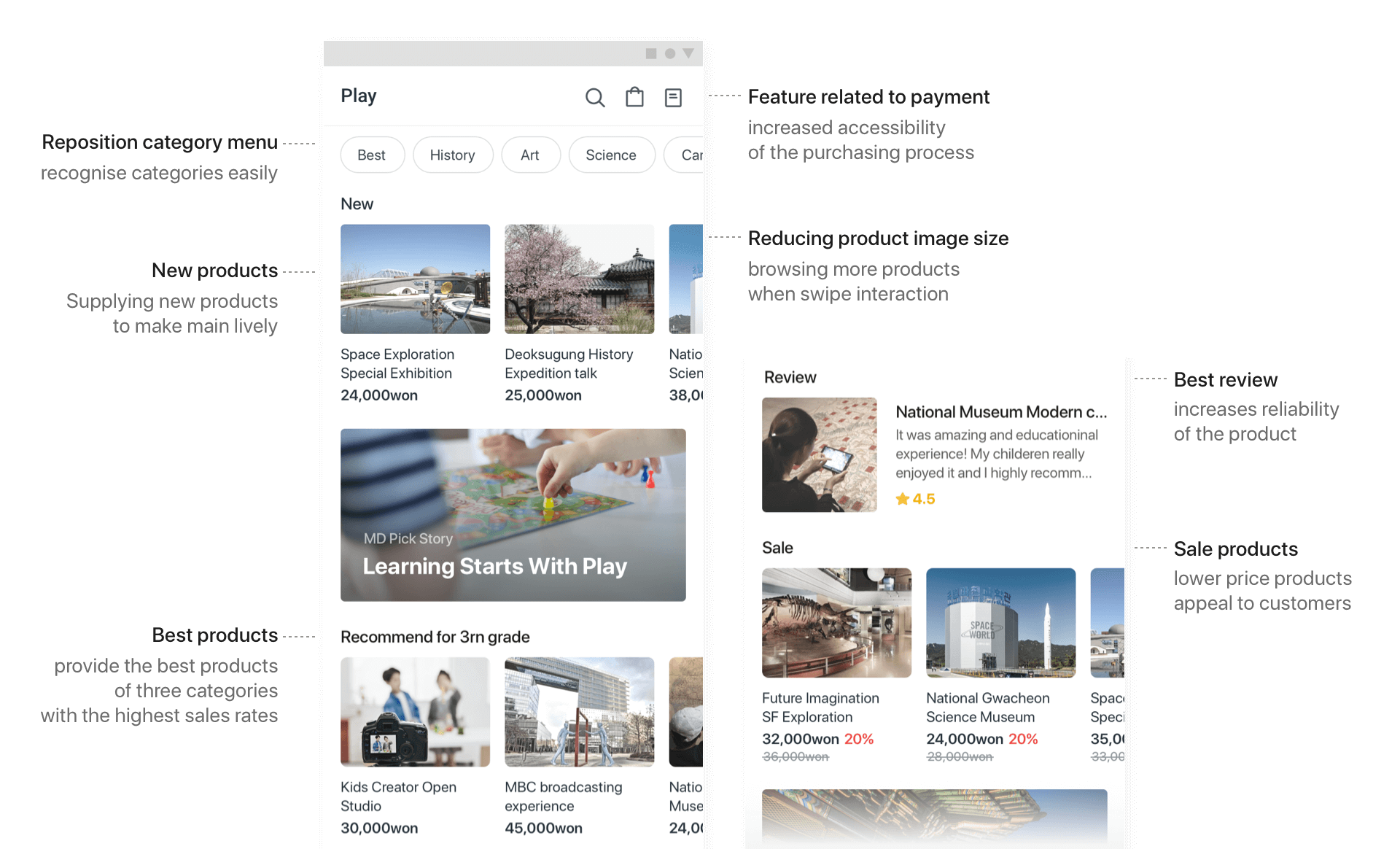
Main page and solving problems
Users can browse more easily through recommendations. The shopping cart function is placed at the top so that it drives users to purchase. As the category menu is on the top tab, users can browse the products easily.
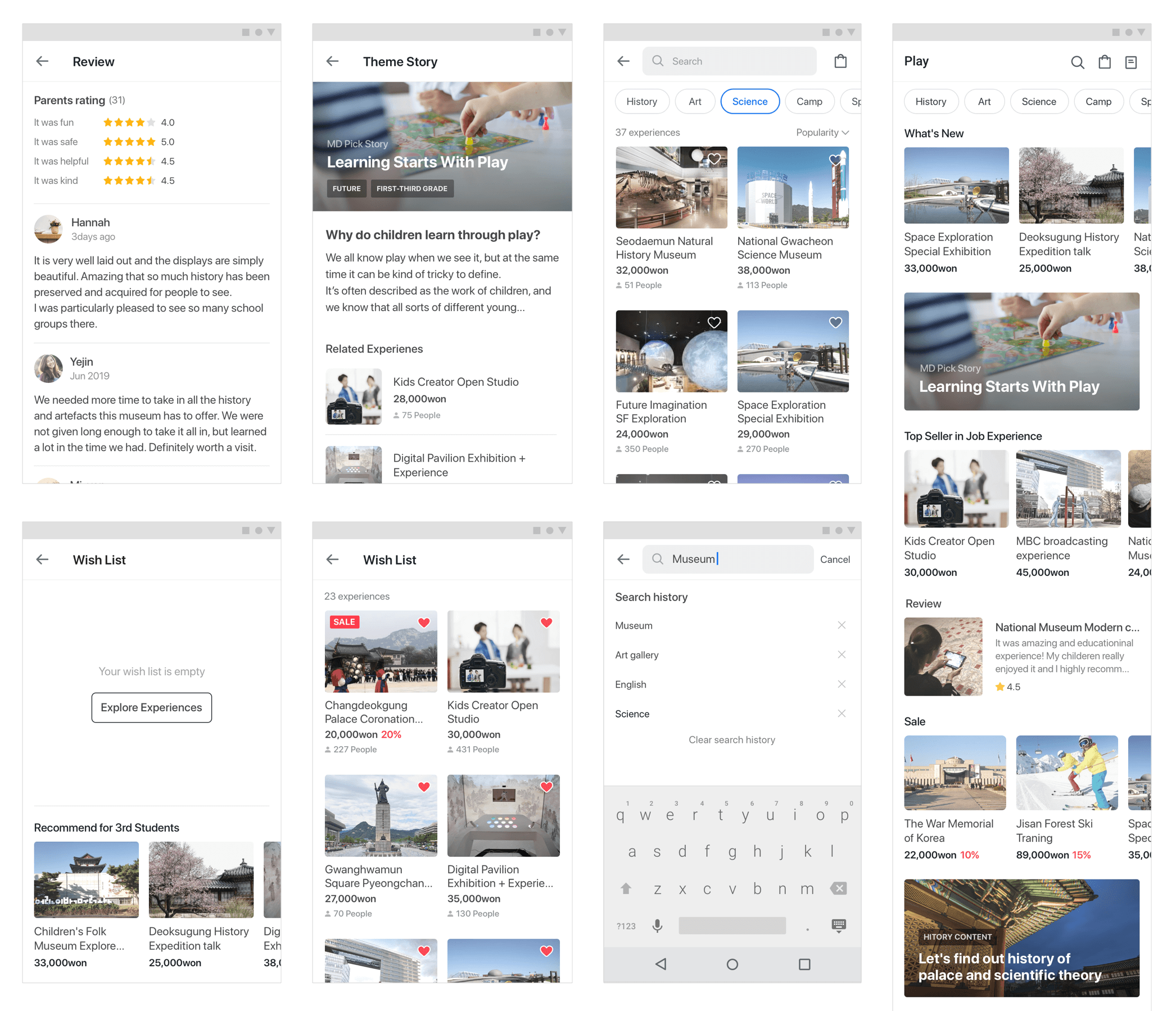
Look into other pages...
Challenge
We focused on interface-oriented modification as considering the tight schedule. It was a bit challenge to reorganize better user experience based on previously developed functions. But It was able to improve the usability of many pages in a short time.
I had to provide an extensive design pattern in consideration of the new project. I checked the aspects of the new content in advance to construct the UI pattern. Considering the result of the next project in progress required many discussions.