Making shopping experience better
As the number of service users increased, the app needed more fashion products. We considered the users’ needs and redesigned the category pages so they could find products quickly.
Setting up strategy, Hi-fidelity prototype, Interaction Design, Design iOS and Android
2weeks, January 2018
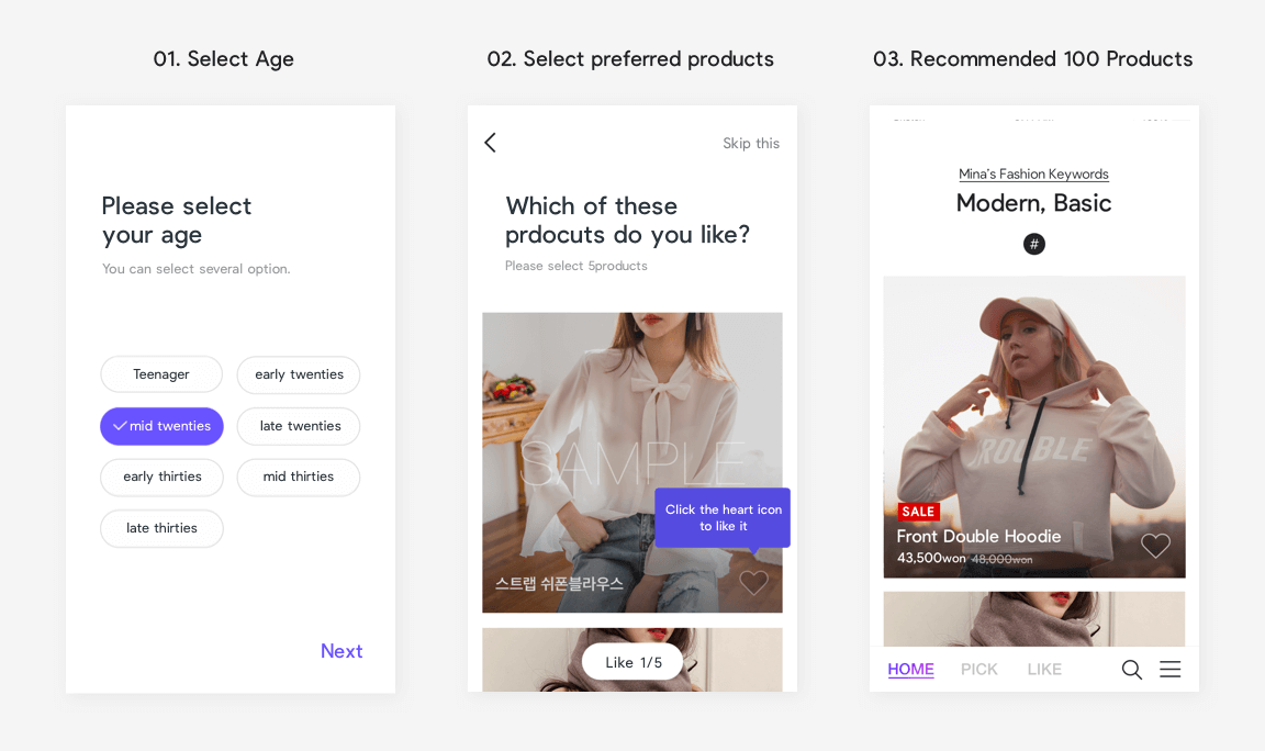
Personalised curation service that analyses users’ fashion style
Users select their age and preferred products when they begin. The app recommends 100 new products every day. The more a customer uses the app, the more accurate the product recommendations are, based on their click data. After recognising our customers’ need to see more products, our design team provided more services, such as a category page with various filter functions.
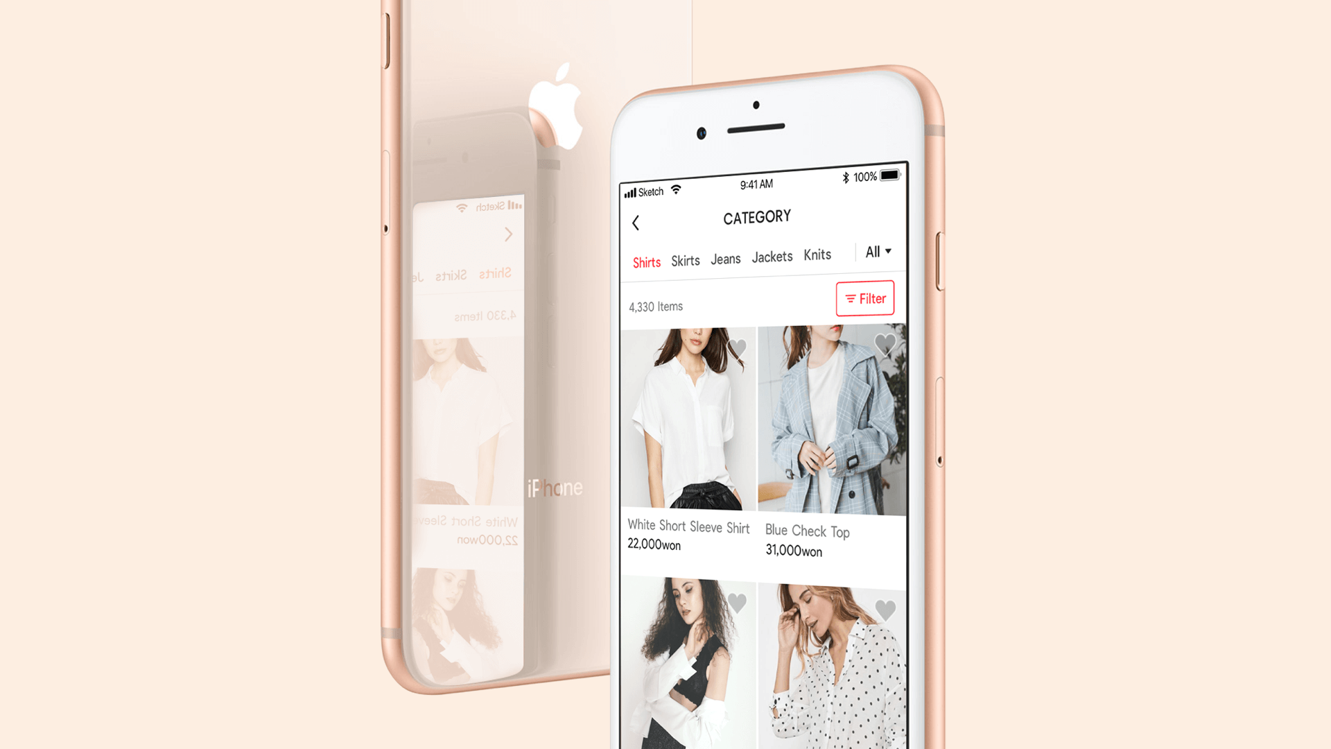
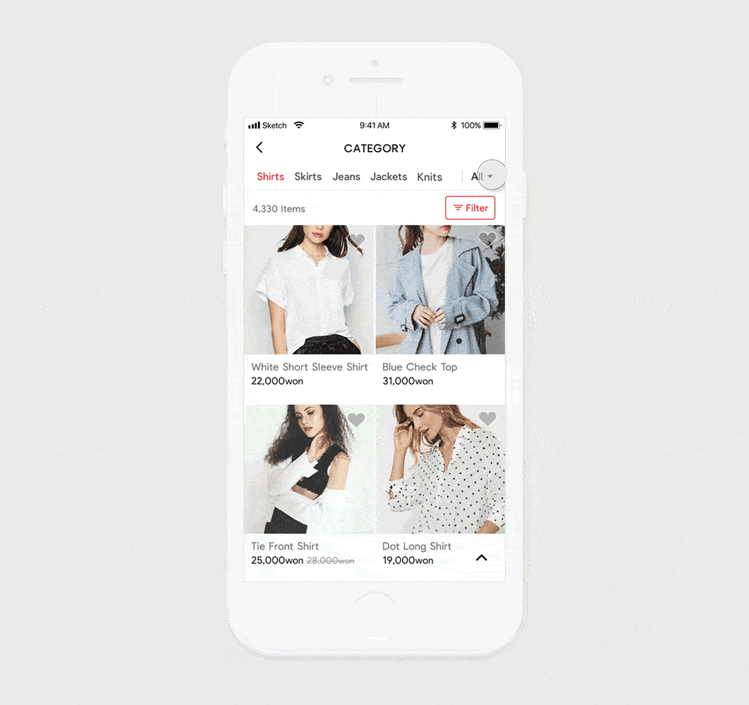
Allowing customers to quickly find the product they want
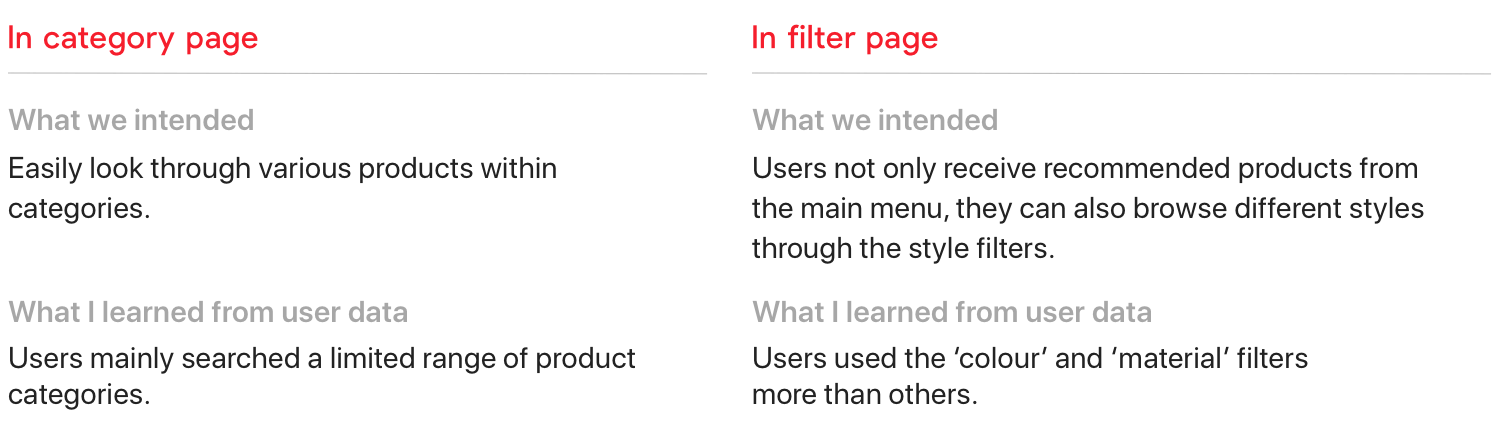
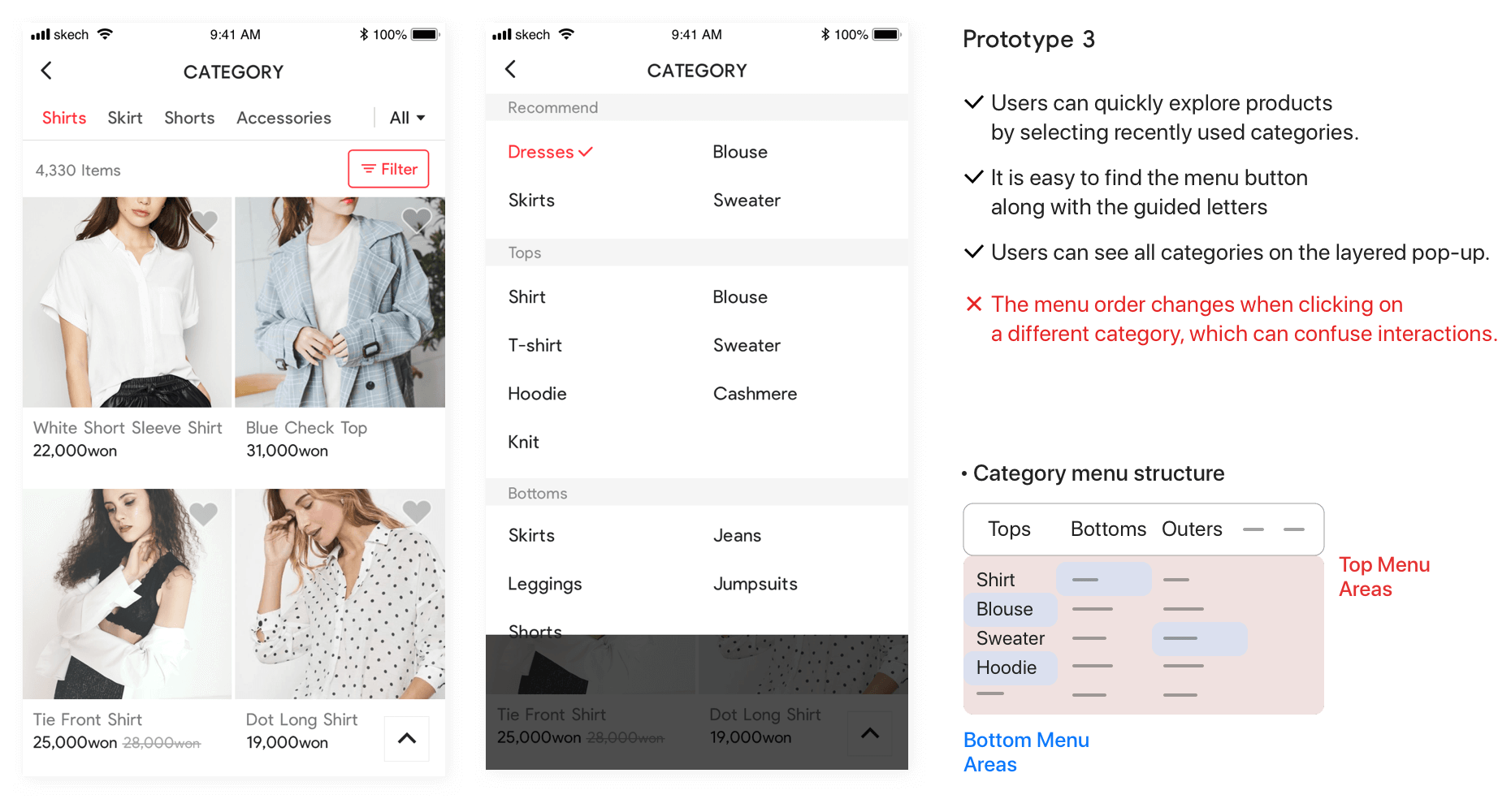
1. Increase convenience surrounding the navigation of category menus. There are 26 categories, including main menus and submenus, such as women’s tops, bottoms and outerwear. We tried to help customers quickly navigate to the categories on the category page.
2. Maintain the app’s core concept to deliver products based on user data. We expanded the core concept of the app on the category pages to deliver a consistent user experience.
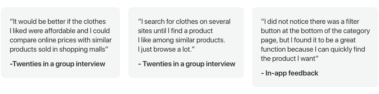
What do users think about shopping on the app?
I needed to understand our users’ problems to successfully redesign the app, so user feedback was developed. Our customers are women in their early twenties to mid-thirties. We collect in-app feedback and user interview to understand customers’ needs.
Organising the problems of the current page
The click rate of the category page was higher than both the brand page and the search page that comes after the main page. I talked to a data analyst to see if there were any patterns present in users’ behaviour to make an accurate decision. Throughout this process, I gained insight into what customers want.
What I learned from the data
By analysing the data, I found that the click rates of some categories, such as ‘one-piece blouse’, were significantly higher than those of others. So, users looked for limited categories of products and searched the same categories multiple times. I collected their click rate data on the category page and found that over 50percent of users select fewer than five categories. When customers use filters, they tend to choose the ‘colour’ filter over the ‘style’ filter.
Focusing on customer behaviour
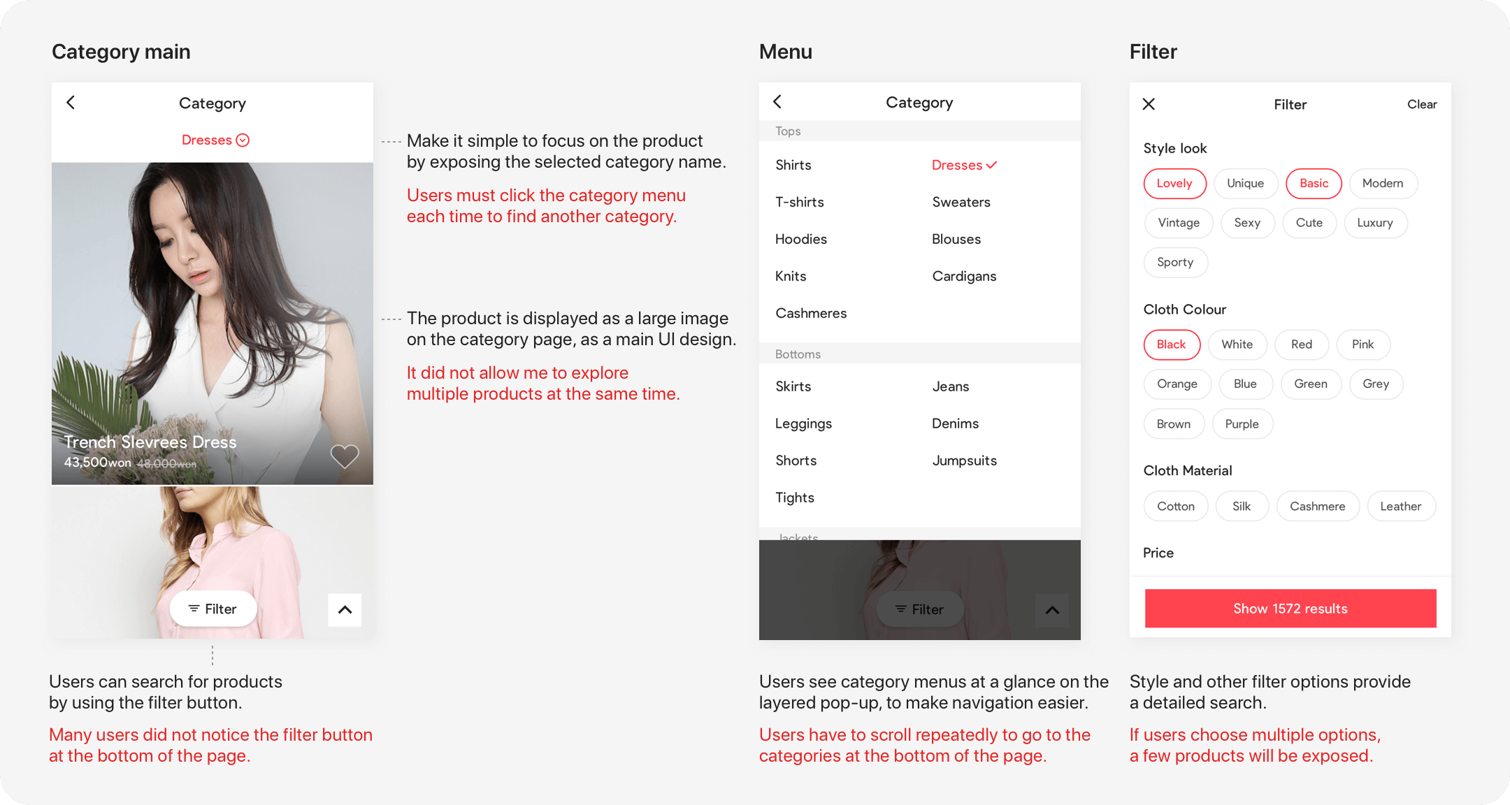
The categories that users frequently select are likely to be purchased from. By showing recently selected categories, users can quickly look at the product without having to click the menu multiple times.
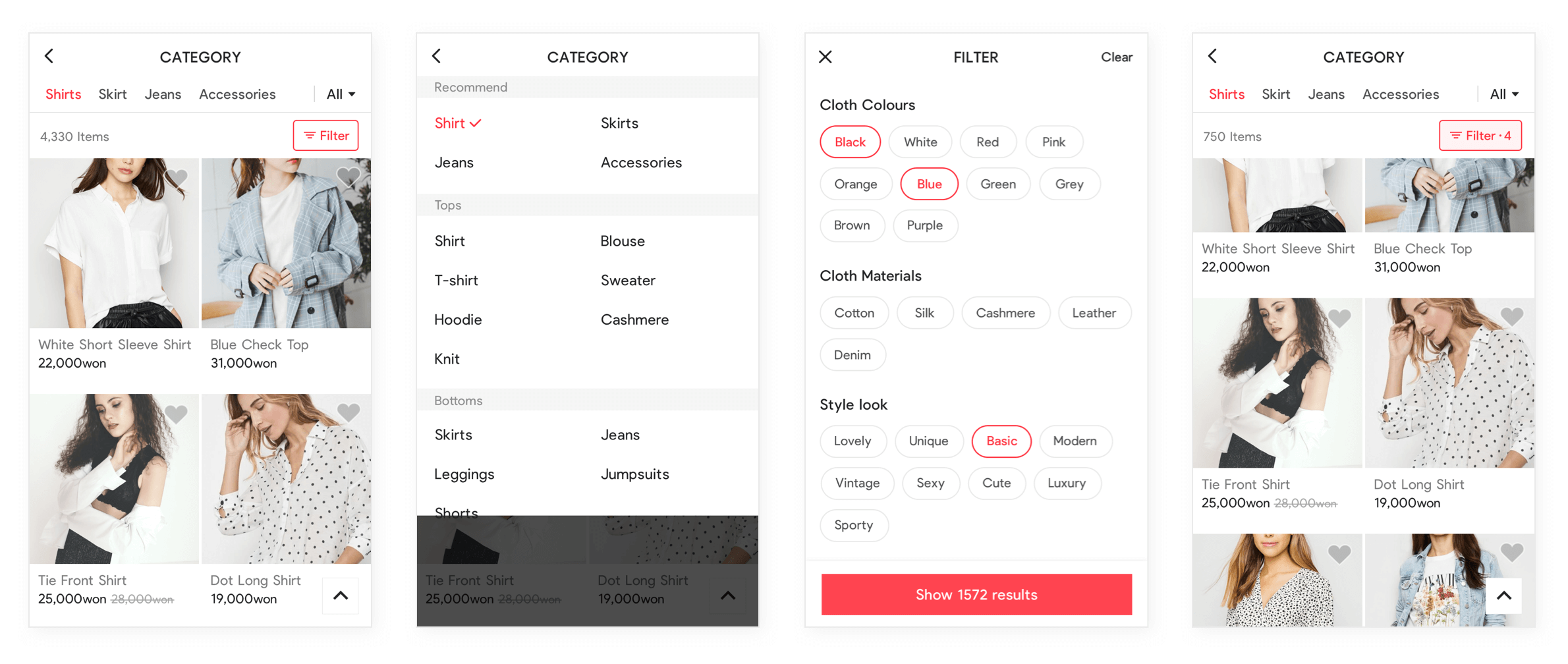
I changed the filter position so that the customer could recognise the filter button after selecting a category. I changed the order of the filter elements according to users’ click rate data so that users could access useful filters at the top of the filter page without scrolling.
Creating high-fidelity prototypes for the assumption
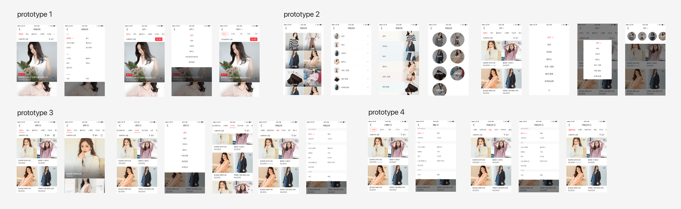
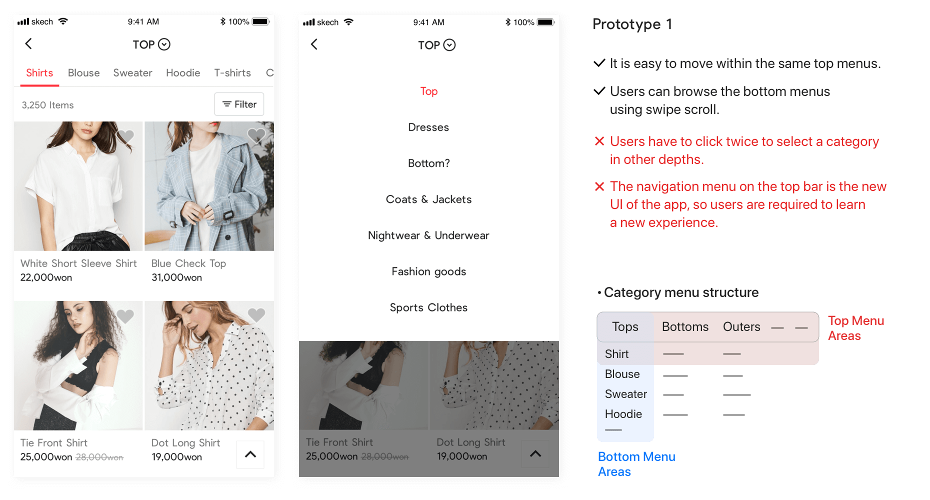
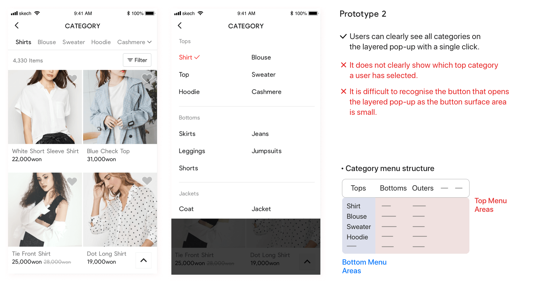
Prototype structures with various category menus
I requested to examine the basic menu structure, and we reviewed the advantages and disadvantages of the prototype. After an agreement was reached, the C type was adopted.
Main and filter pages
The main page has more information, and it is easy to recognise the filter button. Users can browse more products after viewing recommended products.
Learning from this product
I had to consider detail interactions when proposing a simplified menu structure. Making a high-fidelity prototype helped us to estimate the result.