Redesigning School Announcement function for teachers and parents
This announcement is about the app product’s primary feature, which accounts for over 30% of its usage rate. It was necessary to enhance the function based on the growing needs of our customers. I shipped the class notification redesign to enhance the app's functionality and usability.
Setting up strategy, Interview, Low-fidelity Prototyping, Interaction design, Android and web design
Three weeks, March 2019
Classting App is an educational platform with more than 5.5 million users, including teachers, students, and parents. It has been adopted by more than 90% of schools in South Korea.
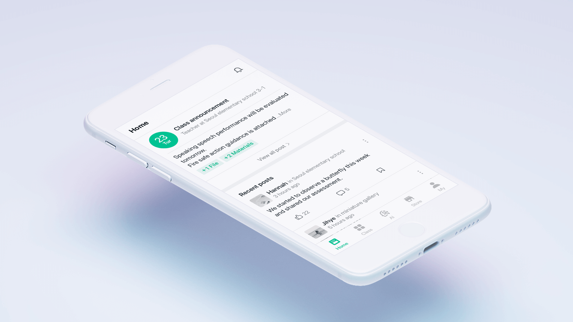
Classting App is an educational social networking service that provides effective ways of communication between schools and families and is top-ranked in education charts. Teachers can deliver an announcement in real time via free SMS on their mobile phone.
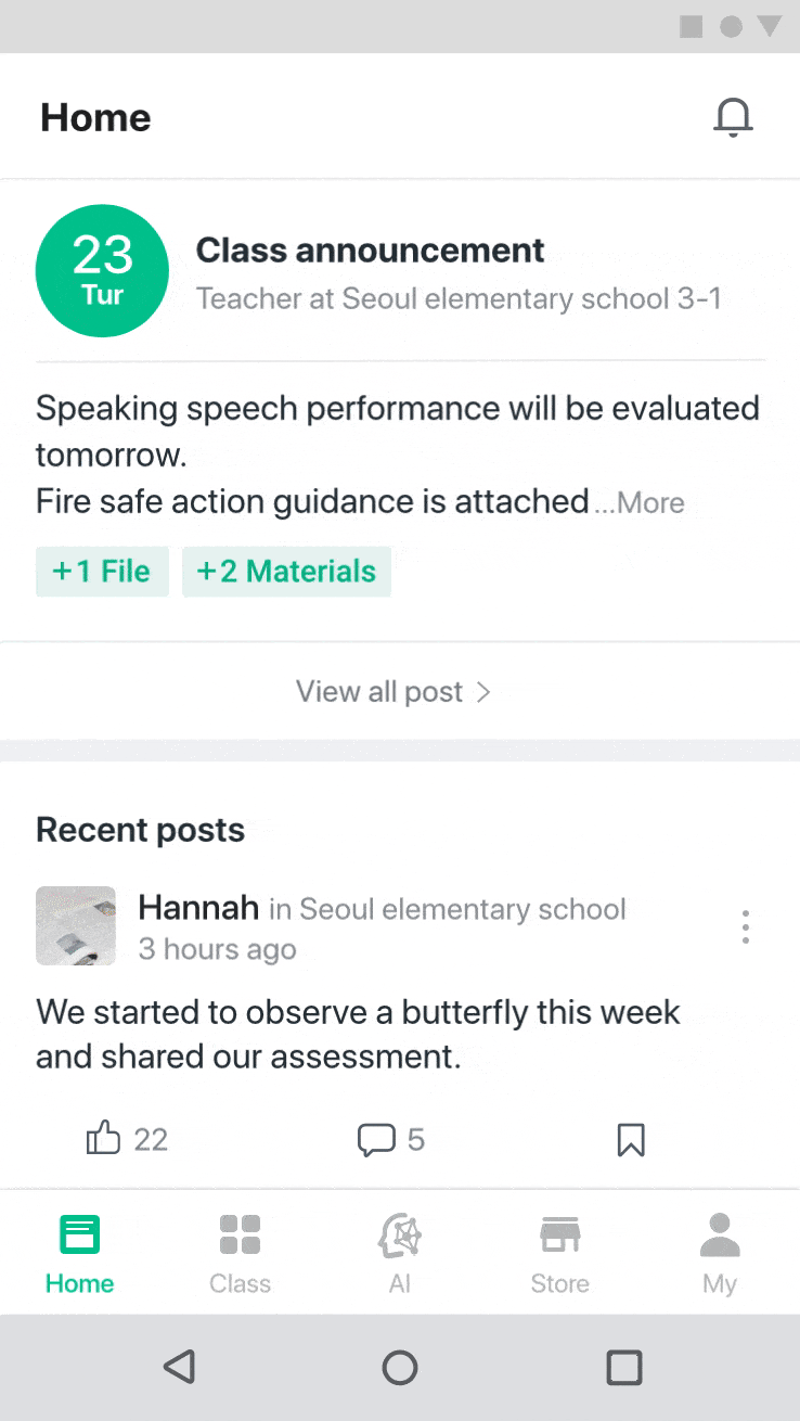
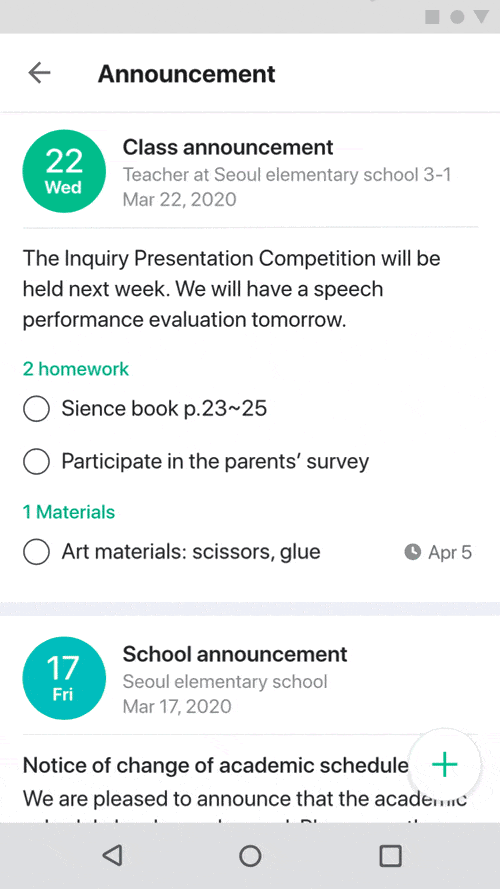
Convenient announcement function for parents and teachers
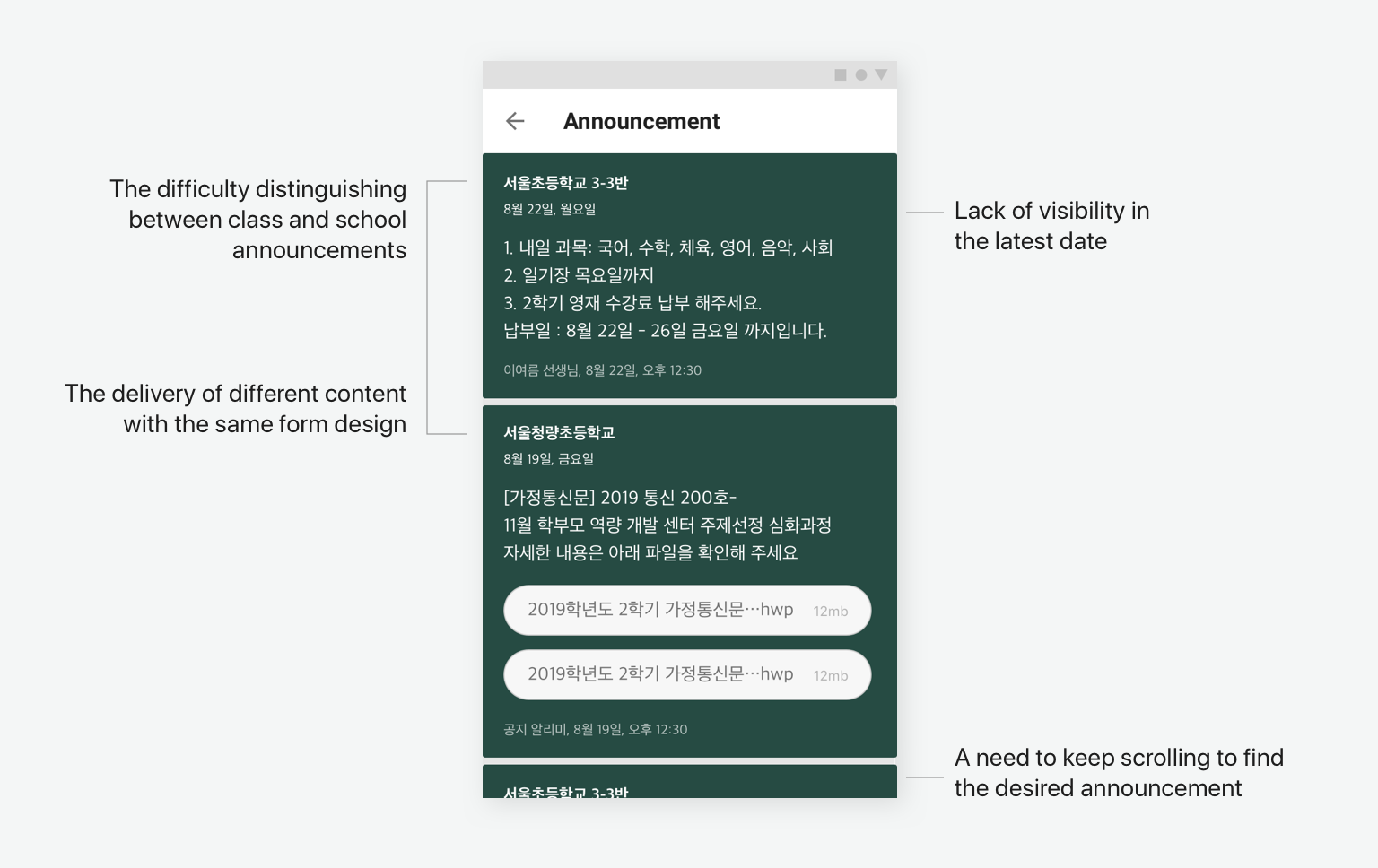
The announcement page is complicated as it delivers school and class announcements and parents' notices on one page. The purpose of this function is the efficient delivery of a large amount of information related to the school. There is various content on the announcement page, so it is not easily readable at a glance. Thus, the lack of readability is the main reason for its shortcomings. The announcement is one of the app’s main features and presents an excellent opportunity to create a more meaningful experience for our customers by overcoming the following.
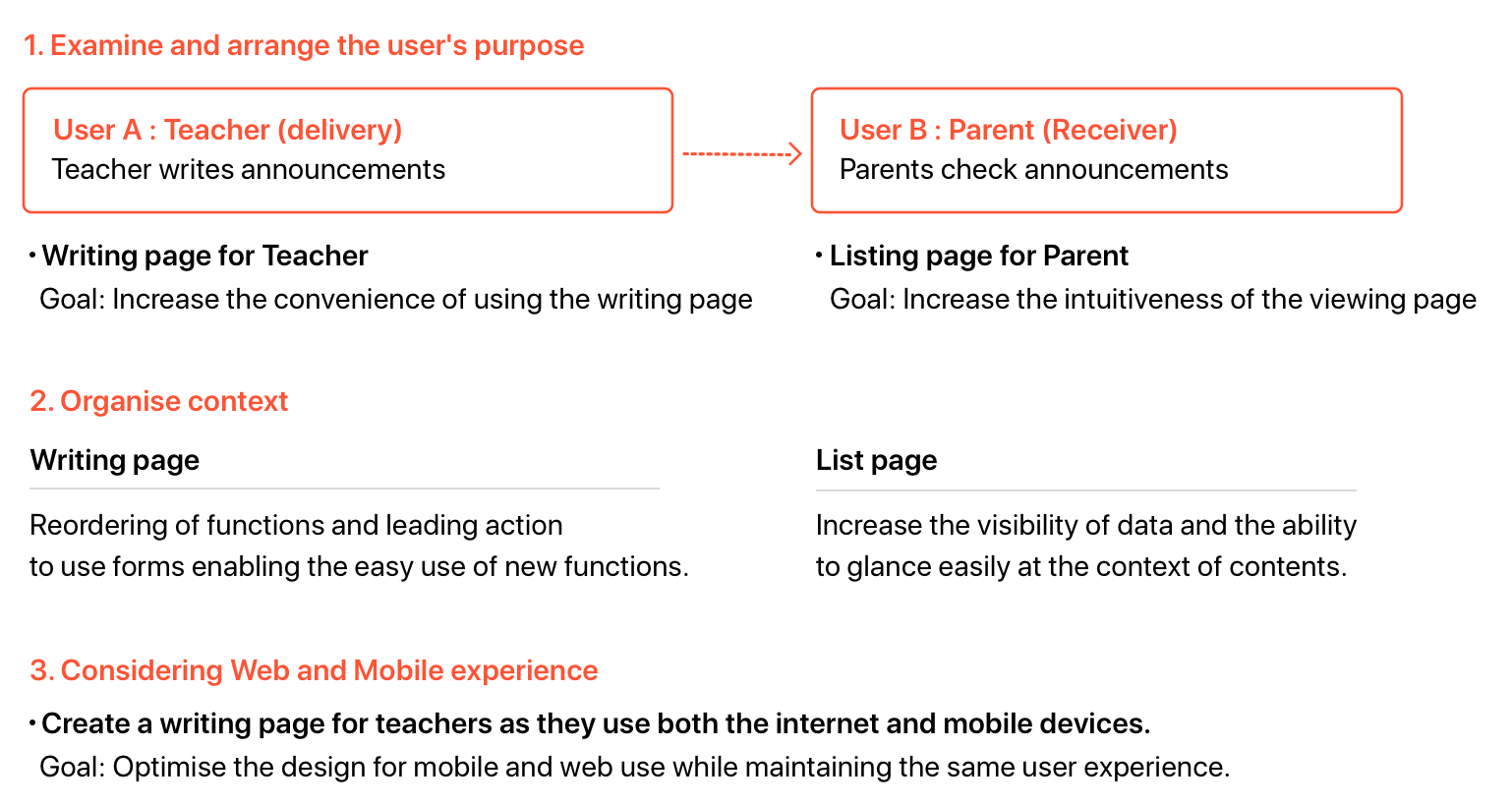
Which user is more important?
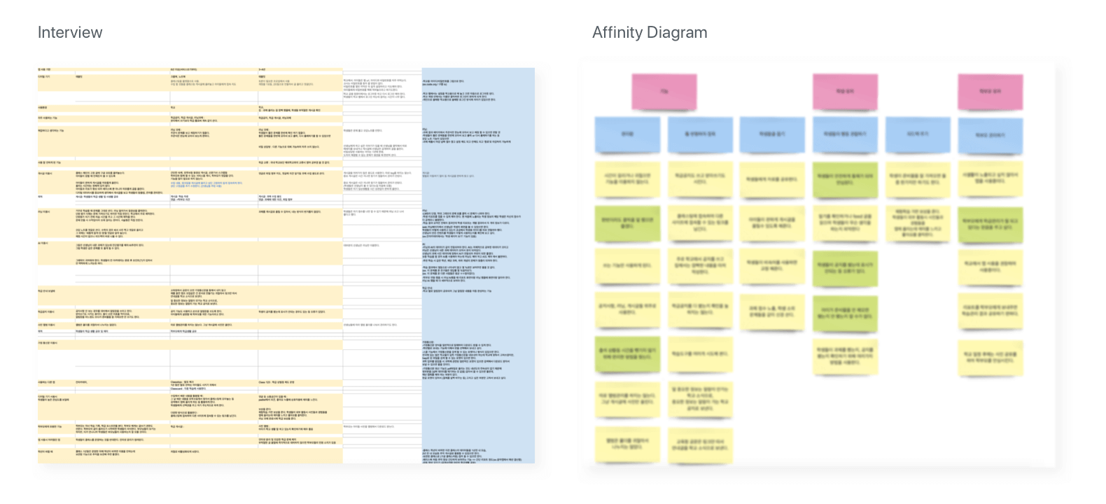
We have two target users - teacher and parent - utilising this announcement function, but the teacher user has a more important role. I interviewed three teachers to determine how and why they use this function. Furthermore, I gained information from teachers in their twenties and thirties who are familiar with using online education tools.
Clarify the goals of the two users
Developing the idea and finding a solution
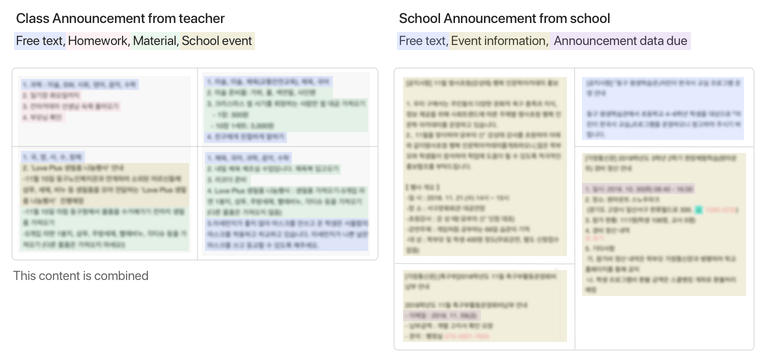
I started to classify the content categories by organising the announcement content. The announcement content structures were different depending on which teacher wrote them.
My interpretation was that the content would be delivered more intuitively by finding the pattern to make them have a consistent user interface design.
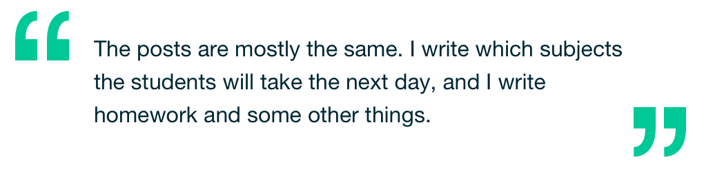
The sentence below from an interview with a customer became a clue to developing this hypothesis.
After analysing data, I defined four patterns of content writing. The content of the list page could be systemised, and I discussed this solution with the product manager and developers. I found that it required detailed interaction to validate technical constraints.
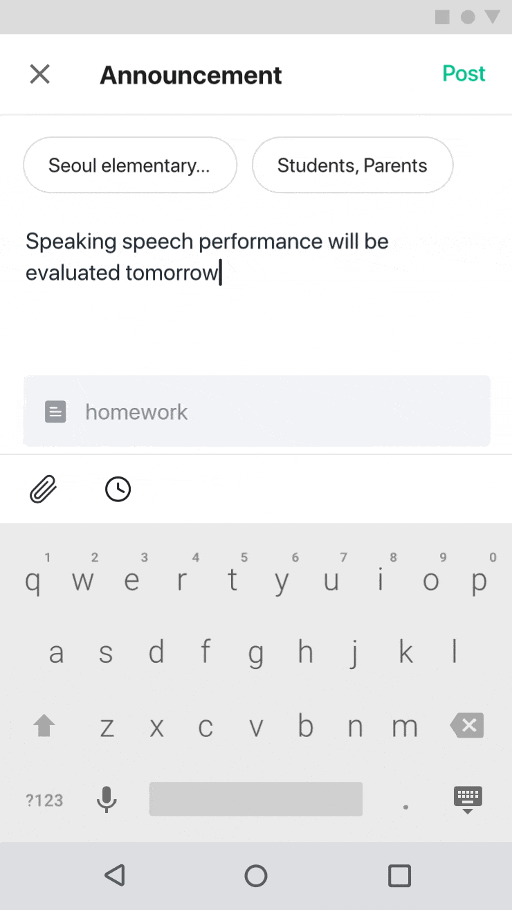
I aimed to allow users to accept context intuitively as users recognised the content form. I made a prototype not only to provide announcements but also to enable the user to interact with the information. To do this, I devised prototyping of writing page.
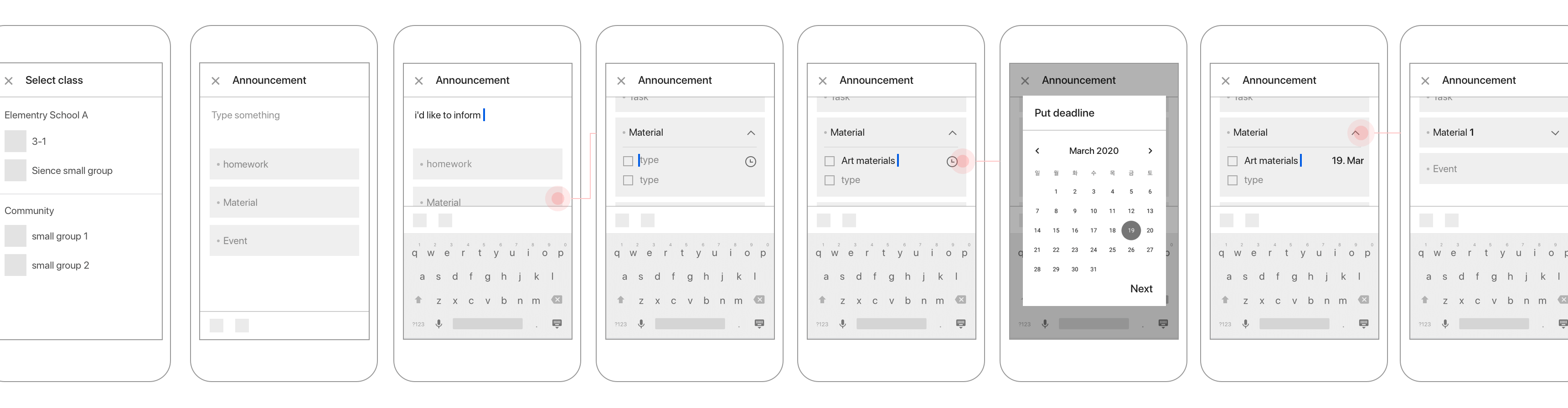
After that, I created rapid prototyping with invision and arranged detailed interaction and further screens for development. The final design screen is below.
Users should be able to see what they can do on the writing screen at a glance. To effectively use a narrow area on the mobile screen, users can fold and unfold the form area. I devised these interactions that allow a user to predict and guide the next action without an additional click.
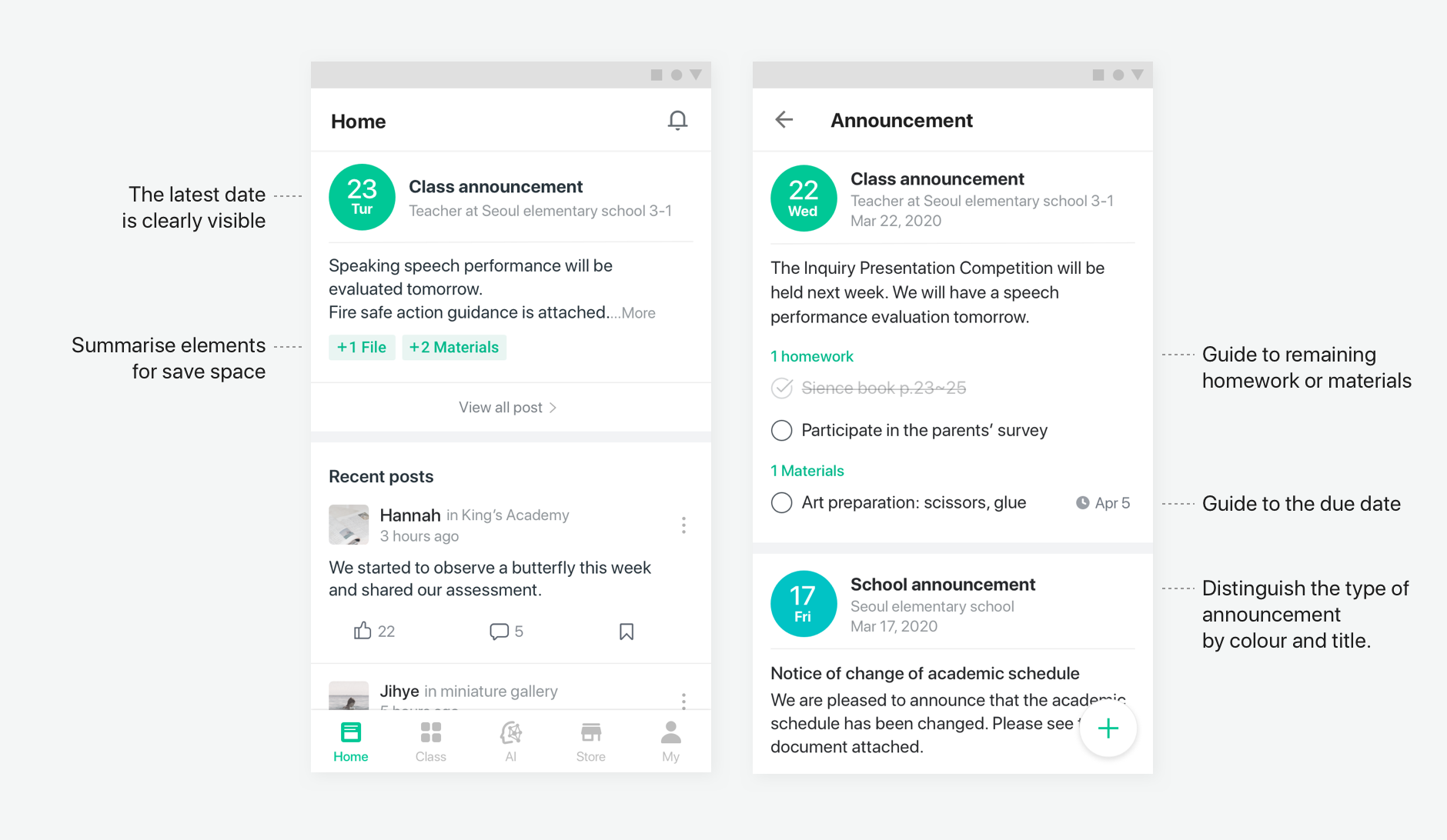
Users can distinguish school and class announcements at the tops of the titles. Users will intuitively recognise what they have to do through the checkbox and due date. This feature will lead users to view and remind them what needs to be completed.
Users insert school events and assign the date period. It is also possible to add an event by clicking 'Add event’ below.
There are two types of user, and I tried to connect the needs of both to make the purpose of the announcement function clear. The process of organising priorities based on the core users helped me to understand how to develop the user experience.
When adding a new feature on the existing page there were already plenty of features, so the screen had to be redesigned. The repositioning was limited after considering the customers' existing experience patterns and technology frustrations. I now understand how difficult it is to introduce a new design to a product that has been operating for a long time.
Next step
Completing a usability test of the result.
‧ Measures whether accomplishing the task is going to be easy or difficult.
‧ Examines which writing form function they use the most.
‧ Attempts to identify whether students are likely to complete a task than before.